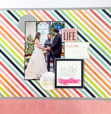
Hey crafty friends. I’m here to share with you today a simple wedding layout I recently made for my sister. She’s married two years just this week.
The layout was a from an old Scrapbook Generation kit, but I didn’t use it as they suggested. The papers were from Heidi Swapp, and surprisingly some of it can still be found on Amazon.
This layout is part of a two page spread and the other side is rather busy. It’s all 4×4 blocks with photos and project life cards. I chose then to keep this side simple to not overwhelm.
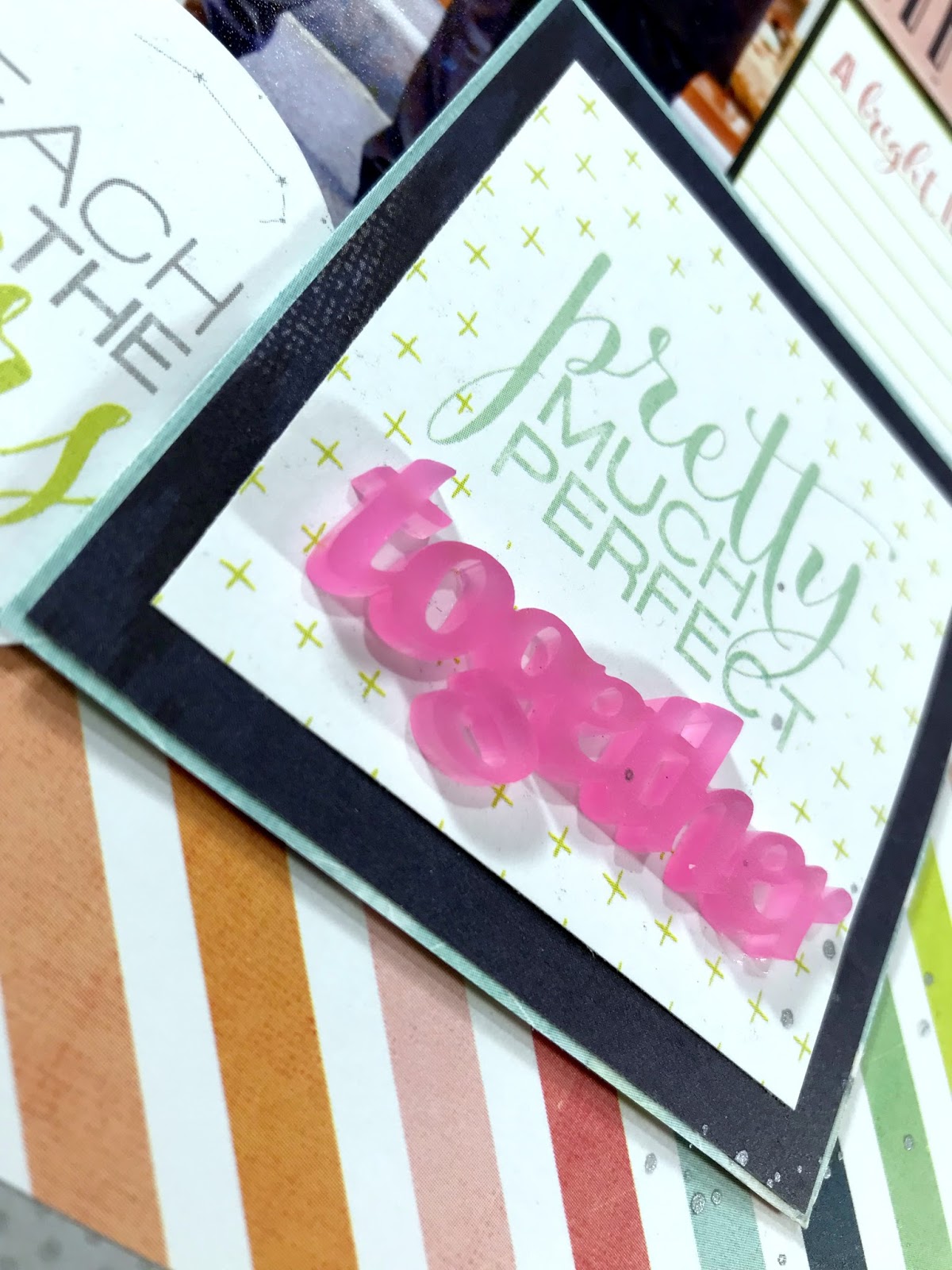
The “star of this side (well besides the photo) is the title of pretty much perfect..together. It was a 4×4 card that I layered and added an old Scraptastic acrylic piece to to create a more wedding themed title. To attach the together I used my ScraPerfect Best Glue Ever as it’s strong enough to hold the heavier acrylic piece.
So…now it’s your turn. Do you alter sketches or cards to fit what you’re trying to scrap? Share with me your tips/tricks and layout links!#CelebrateWithScraPerfect


